From research with our target customers we learned that it can take as long as 40 hours to build a Resource Library using traditional methods.
We knew that the Beacon Resource Library tool was much faster than that but how could we make it super obvious to new customers?
We came up with the concept of a zero signup tool so people could use the Resource Library Builder without even creating a Beacon account.
The idea was to drastically reduce the time-to-value for the user by removing all unecessary barriers.
Project Skills
- UX Design – Wireframes.
- UI Design – graphical mockups.
- Front End Development – HTML, CSS.
Above The Fold
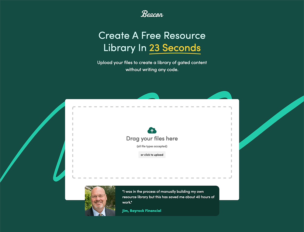
I know lots of digital designers hate the term ‘above the fold’ but no matter what you call it, that top portion of the screen is by far the most important section of any landing page. I made the most of this precious screen real estate by:
Removing Navigation
I completely removed our standard navigation so there was nothing competing with the main call-to-action. The target audience of this tool is new users who are problem aware so they don’t need to browse our other products or log in to an existing account.
Adding Social Proof
Uploading files to a website can be a scary prospect so I wanted to build trust early. A friendly face and a testimonial helps to reassure people that this product is safe to use.
Huge Upload Area
You can’t use the tool if you don’t upload some resources so I wanted to make that impossible to miss. In this case the large ‘drop zone’ with the dashed border is the call-to-action.
Video
Video speaks a thousand words so when you’re telling people that a task takes 23 seconds you may as well show them to prove it.
This video may not look very ‘designed’ but the idea was to show the real product in action without fancy edits. The hardest part was making the video feel natural even though it was scripted.
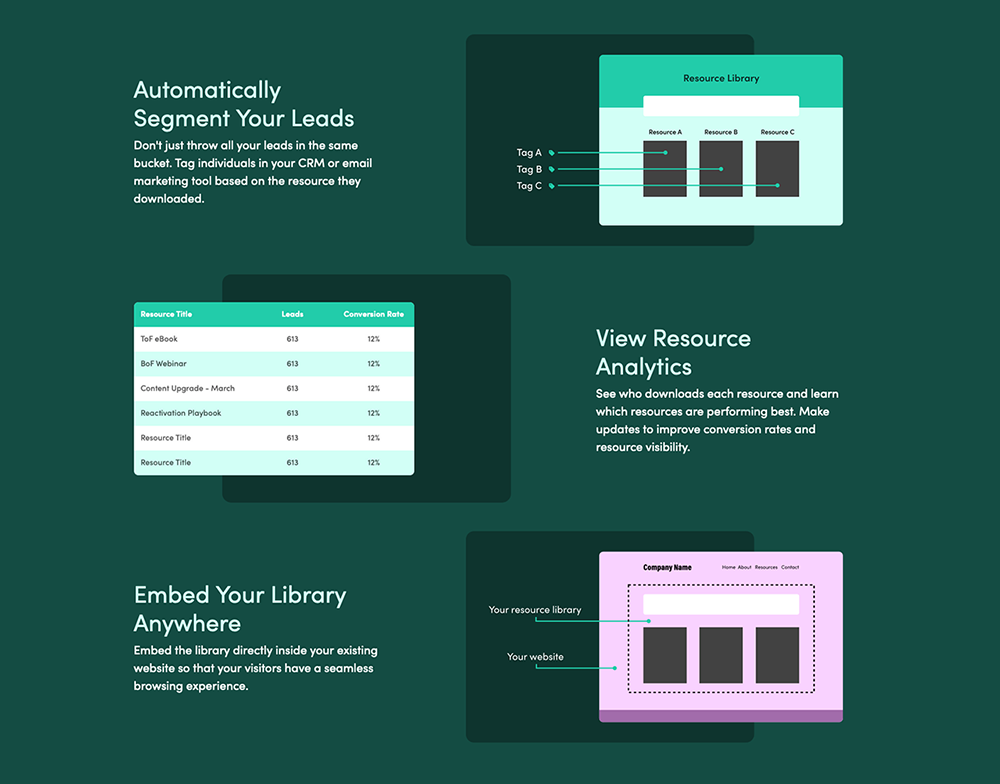
Graphic Design
Much of the typogrpahy, colour scheme and iconography had been determined as part of the dashboard redesign so this project was much more about what content should be included and where.
I did get the chance to make some nice stylised product screenshots though:
Front End Development
For a project such as this I like to handle the HTML / CSS build so I can make sure that the details are correct and I can fine-tune the mobile versions throughout the testing process.
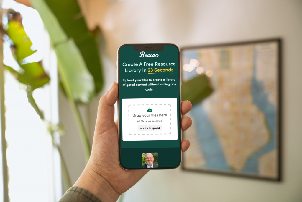
I use Bootstrap so our developers will be familiar with the end product but it’s much easier to hand over a finished HTML file than a Figma template with lots of notes.