Background
At the time of this project Beacon had grown as a product and was now a suite of three tools instead of just one. This meant that our existing onboarding flow emphasised one product more than the others. As a result new users had a confusing first experience in the app.
Project Goals
- Ensure that a user’s first experience aligns with the ‘job’ they had in mind when they decided to create their account.
- Help more users reach their ‘aha moment’ faster.
- Ultimately increase conversion rate from free to paid.
Project Skills
- UX Design – quantitative anlysis, wireframes.
- UI Design – graphical mockups, prototypes.
- Front End Development – HTML, CSS.
Planning
When people sign up for Beacon they do so to create 1 of 3 things:
- Create a lead magnet
- Create a lead capture form
- Create a resource library
I started this project by mapping out the ‘creation flow’ for each product:
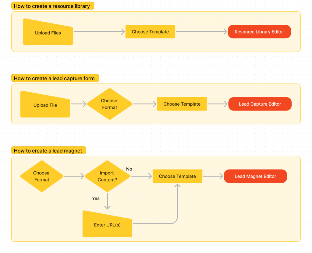
The goal here was to remove as many unncessary steps as possible so users don’t get bored in a long setup process. I want users to be able to show users some type of visual output as quickly as possible, even if it isn’t the finished version of what they are making.
Starting Point
I wanted to drop users directly into the creation flow that was most appropriate for them instead of having them ‘self select’.
The easiest way to do that is to tailor the onboarding flow depending on which page on the marketing site the user had signed up from:
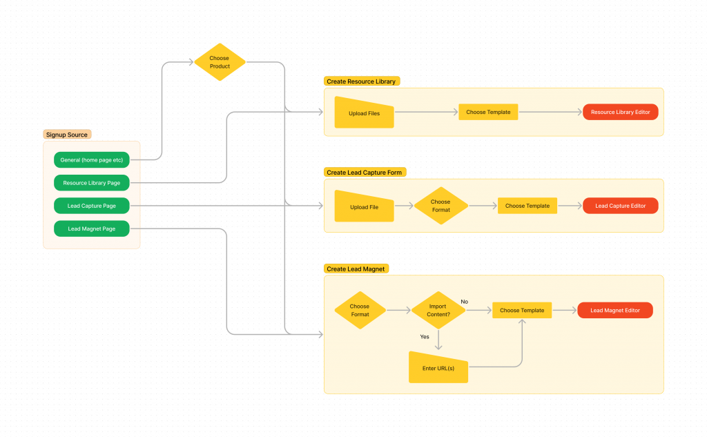
So if someone signs up from a general page like the homepage then they will be asked to choose their product, but if they sign up from a product specific page then they will be dropped straight into the ‘create’ flow for that specific product.
One Job Per Screen
Now I could start to think about how this might look visually inside the app. Beacon’s users are a mix of B2B and B2C so we always lean towards simplicity. Simple interfaces never alienate anyone but as soon as you start over complicating things then some users will start to drop off.
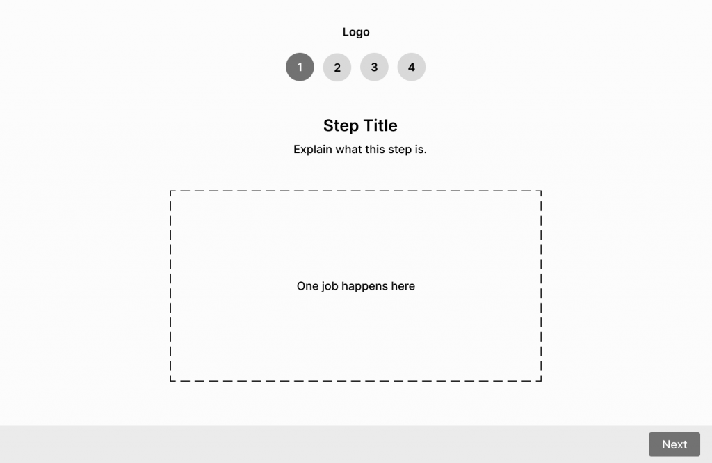
For that reason I decided to have each step of the creation flow on a separate screen within the app. One screen, one job, no distractions.
This is the general wireframe that I came up with for the onboarding screen:
No Navigation
I tend to think of onboarding like a marble-run. There’s only one way to take a user to the end destination so don’t give them an opportunity to go off path. I do include a (non-clickable) logo though just so people know they’re in the right place.
Progress Indicator
Progress indicators like the numbers at the top of this wireframe let people know how much work is involved in a process and where they currently are. It helps people to keep making progress if they know that there is only a few steps involved.
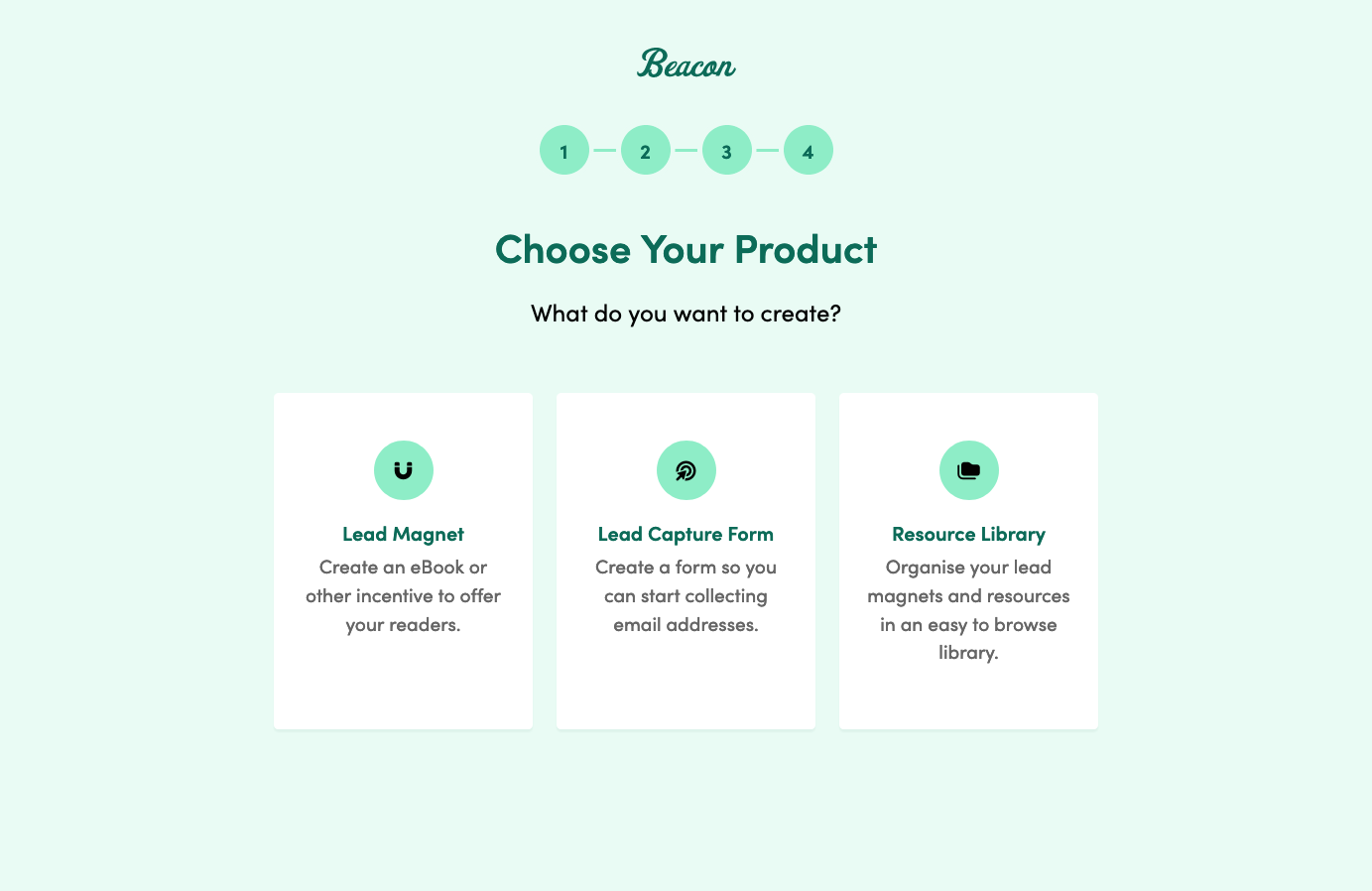
Mockups
When I applied our brand styles to the wireframes things started to take shape:

Some user jobs are more complicated than others so I tend to design them early in the process. Designing for the most complicated interaction in any scenario first helps me to be mindful of any constraints that I will need to incorporate into the simpler screens.
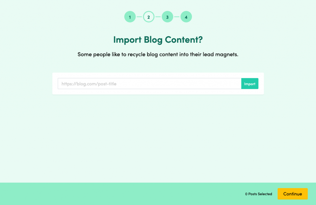
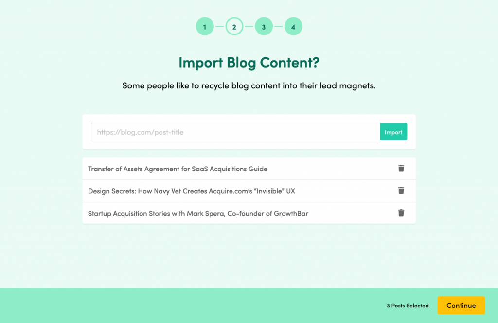
Take the blog import screen for example. I had to make sure there was sufficient room for multiple imports:
Lifecycle Marketing
When I was designing this onboarding experience I was very aware that a user’s experience will extend beyond this first interaction with the product. Ultimately I wanted people to be successful with Beacon and due to the nature of the product that can’t always happen instantly.
For that reason I worked with the development team to pass certain user data to our marketing automation system. The idea was to record simple data about decisions people made during the onboarding flow so we could sent automated emails based on their behaviour.
For example, we logged which product someone signed up to use. That way I could be sure to only send emails relevant to that particular product rather than confusing users with irrelevant information.
We would also tailor the communication that we sent to users based on lack of behaviour. So if someone signed up to use the lead magnet product but didn’t actually make a lead magnet we would send them emails with helpful hints for progressing.
Results
For a project like this we measure impact on a rolling basis paying particular attention to the first 3 months. This was the outcome:
- 30% increase in conversion rate from free to paid