Background
Since the dashboard is not the core product and it doesn’t directly generate revenue it’s hard to prioritise this type of project. For years the team gradually added pages and navigation options to the dashboard without thinking too much about the overall experience. Eventually this became a problem that we could no longer ignore.
Project Skills
- UX Design – quantitative analysis, content strategy, information architecture, wireframes.
- UI Design – graphical mockups, prototypes.
- Front End Development – HTML, CSS.
The Problems
Product Expansion
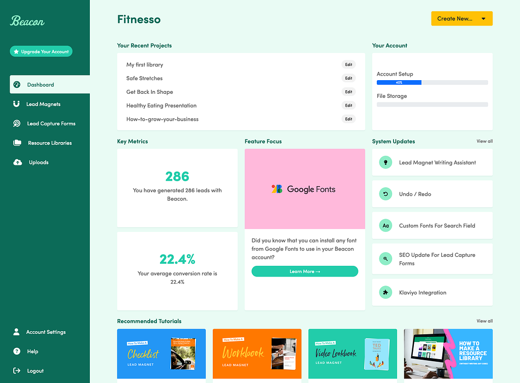
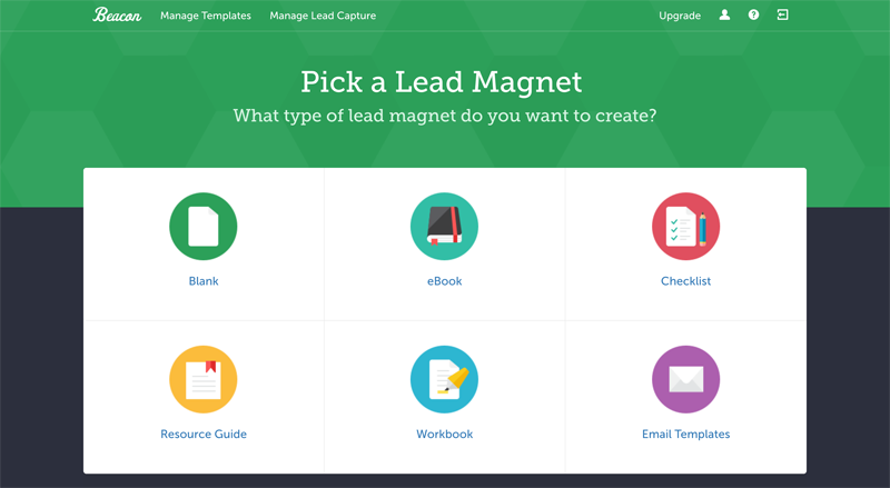
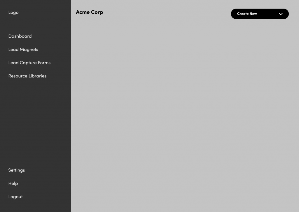
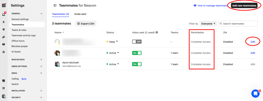
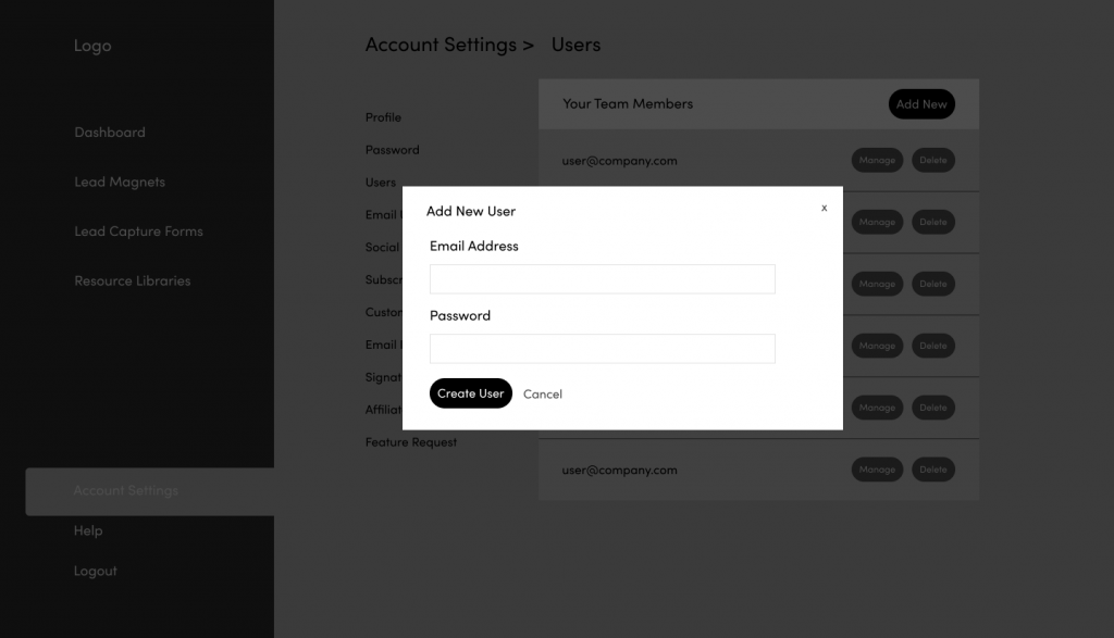
Beacon started as a single SaaS tool for creating eBooks. Over the years our product suite expanded to include 3 separate products. The dashboard UI was still designed for a single product. This is the screen people would see when they logged in to the app:
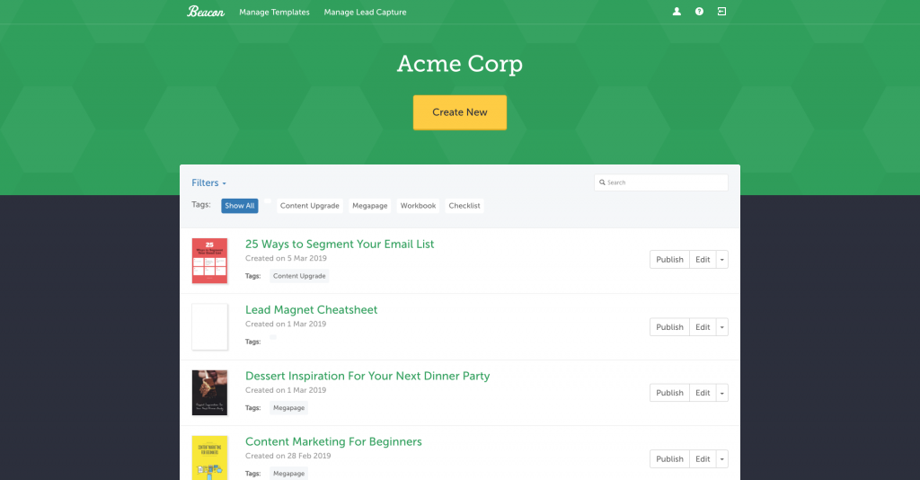
Constrained Navigation
The navigation within the dashboard had been designed for one product. Every time we added a new product it brought its own set of options and settings that had to be shoe-horned into the original navigation.
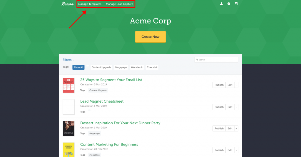
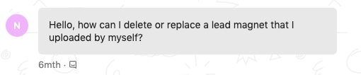
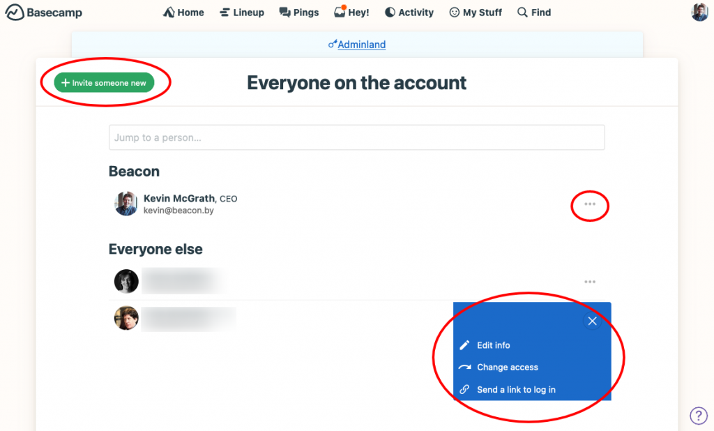
This meant that users could not find basic utility features and when customers start sending messages like this you know you have a problem:
Outdated Visuals
Our visual brand had evolved gradually and while our marketing website had been updated along the way, the dashboard UI remained largely unchanged and was beginning to look dated.
Business Case
I was now convinced that this was the type of project that could contribute towards growth of the business in two areas:
- Revenue expansion from cross-product promotion
- Churn reduction by surfacing functionality that users didn’t know existed
Since I would need help from the dev team to implement a new deisgn I had to get their buy-in before I invested any more time in the project.
We had used Basecamp’s Shape Up methodology to manage previous projects and I really like their template for ‘shaping projects’. This is a simple document that outlines the business case and gives some background to the problem.
You can see the Shaping Document I wrote for this project here
Thankfully the dev team were in agreement so I could now get to work…
My Process
Content Inventory
The first step in any type of redesign is to figure out exactly what you have. I conducted a quantitative audit by visiting every single page in our dashboard directory and plotting them in a sitemap diagram:
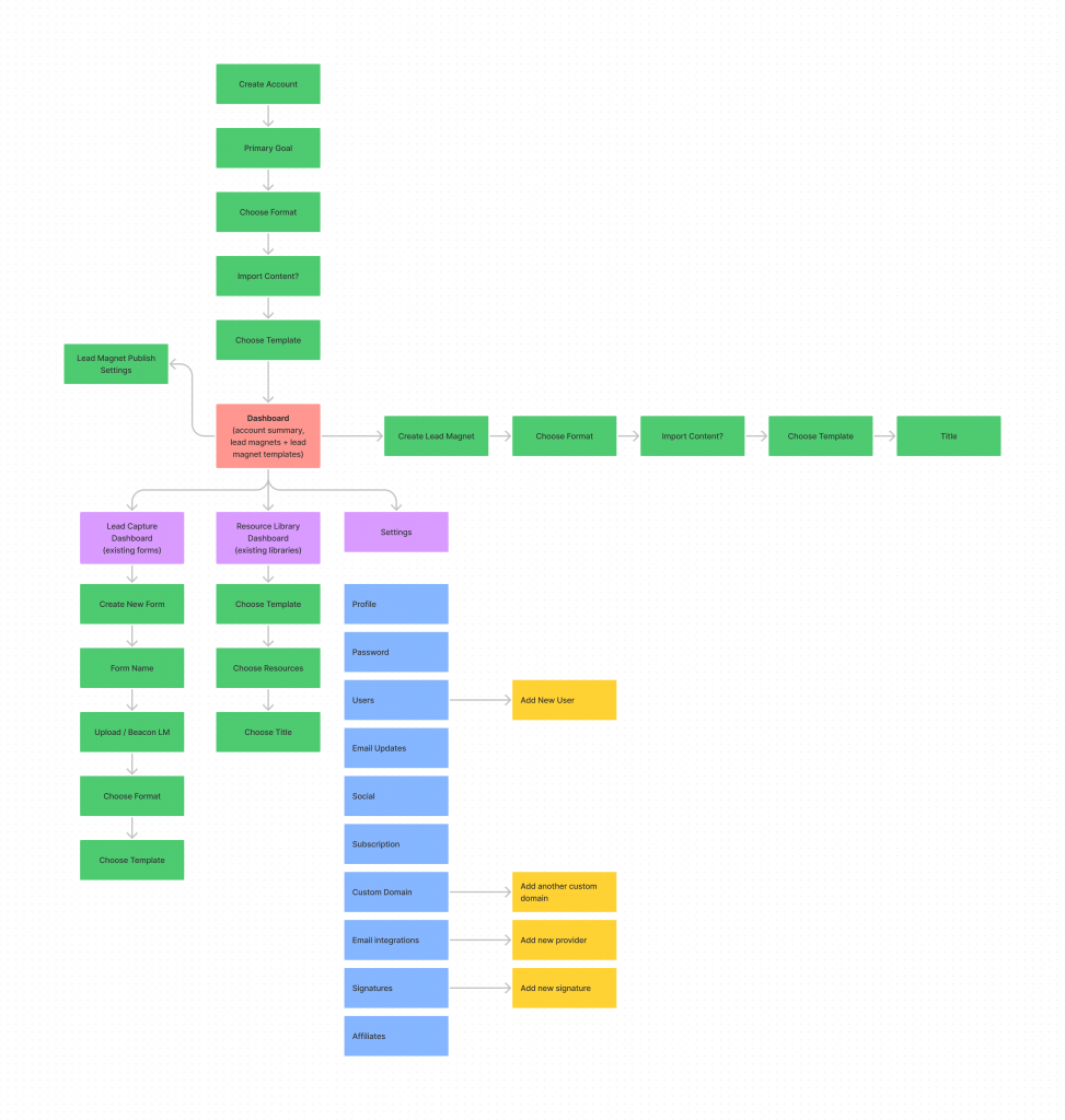
The goal here is to not only determine what content we have but also how it is currently organised. This process also helps me to get into those deep, dark corners of the app that I don’t visit in my day-to-day experience of using the product.
Qualitative Audit
Once I had a list of all the current pages I needed to determine how useful each page actually was. I made brief notes about the function of each page to determine:
- Does the page serve a purpose?
- Could this page be combined with another page?
- What would happen if we removed this page completely?
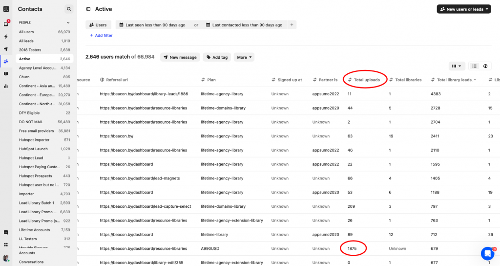
This only took a couple of hours but it really helped me to spot patterns, duplicated functionality and even some pages and features that are no longer necessary. I also cross referenced my list with our internal product analytics to make sure I was aware of the high usage areas of the dashboard. It’s important to be aware of what’s already working so I wanted to be really careful on those high traffic pages.
For example, I was able to see that one of our users had uploaded nearly 2,000 files. That volume of user generated data is quite unusual so I wanted to look at how this information was currently presented in the dashboard to see if I could improve the layout for power users.
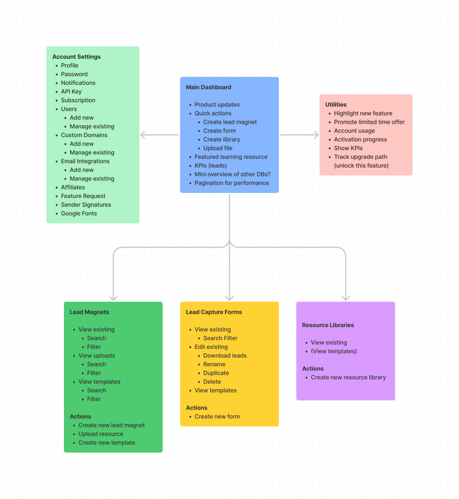
New Site Map
I then took a copy of the existing sitemap and starting removing pages that were no longer required, combining pages that didn’t need to be standalone and adding new pages to help us acheive our updated business goals.
The proposed sitemap was already looking more streamlined compared to its predecessor:
Wireframe Layout Options
Now that I knew exactly what I was designing I could start to think about how it should look. I like to use Figma for wireframing so I can quickly copy and paste elements across iterations without redrawing in a sketch pad.
General Structure
Before getting into the fine detail of individual pages I try to determine the general structure that will be used throughout the interface. The priority here is to figure out the placement of core navigational elements.
I knew from our previous dashboard that horizontal navigation is limiting becuase you will eventually run out of space. I also knew that most web apps nowadays have a navigational sidebar so users are familiar with this pattern.
This is the first option that I came up with:
I was worried that the sidebar took too much screen real estate so I experimented with a collapsed version using icons instead:
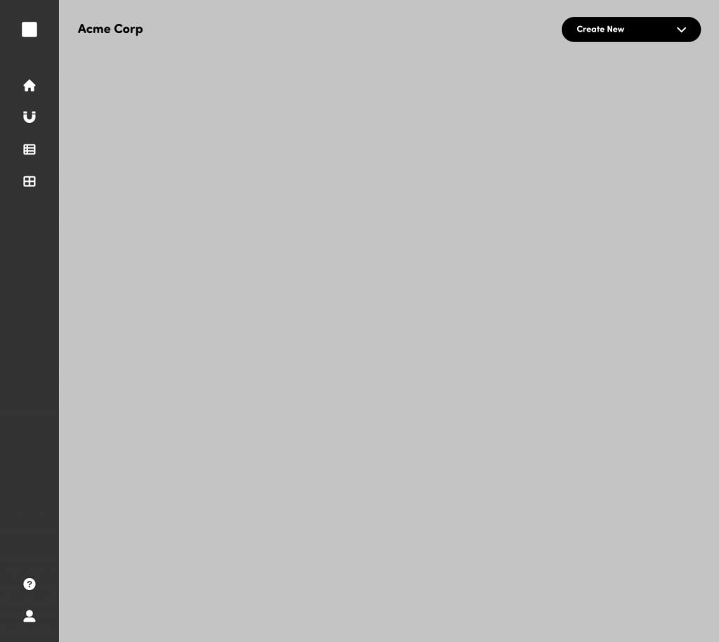
This option was definitely cleaner and it left plenty of room for the main user tasks on the right-hand side but my gut told me that it was too abstract. Our users consist of small business owners, freelancers and marketing professionals. I felt that swapping clear navigation labels for icons would increase customer support messages starting with “where can I find…”
At this stage I decided to take Option A (the chunky sidebar) and use that foundation to tackle some of the more complicated pages. Maybe I didn’t need that extra space on the right hand side anyway? Time to get some real content in there…
Start With The Problem Areas
Some pages have more complicated needs that other so I try to tackle them early in the process. It’s easy to remove elements for the simple pages but it’s a bad idea to spend a long time on a design that will break once complexity is introduced.
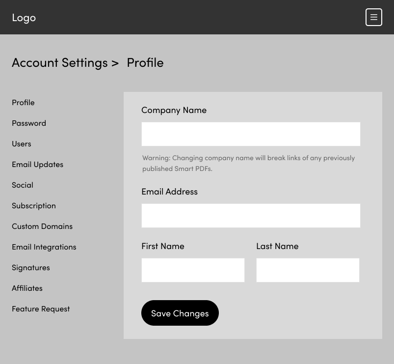
When I was doing the content audit and sitemap exercises it was evident that the User Settings page would be tricky. Partly because of the quantity of content but also because some additional functionality was required beyond the basic ‘update email address’ style tasks.
The secondary nav in the user settings page needed to hold 11 items. Which is a lot. During the content audit I had reduced this from closer to 20 by combining multiple tasks into a single page but it wasn’t possible to reduce any further.
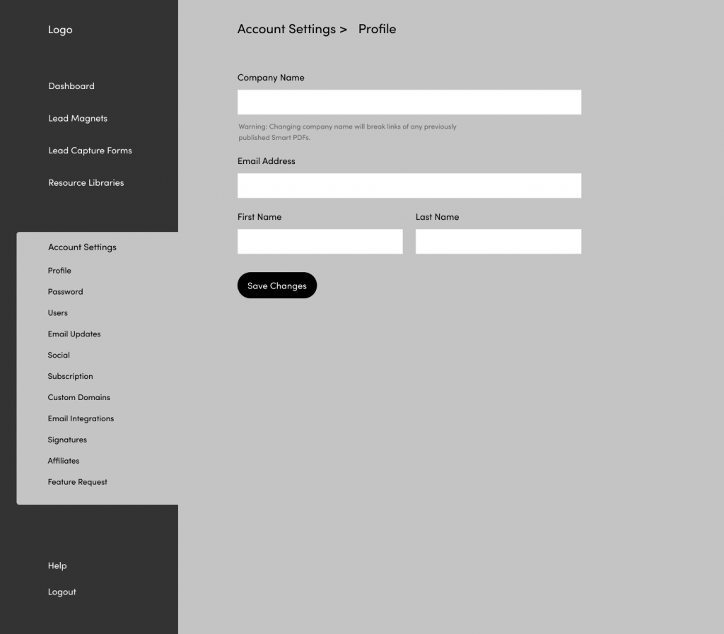
I knew pretty quickly that this option wasn’t going to work. There was too much disconnect between the sub-menu on the left-hand side and the target area on the right-hand side. Users would have to scroll down to pick an option and then scroll back up to do their work.
One thing that did strike me in this layout was that I didn’t need as much space on the right-hand side as I thought. The input fields were already comically long and I wasn’t even using all the available space on the far right.
I experimented with a secondary vertical nav:
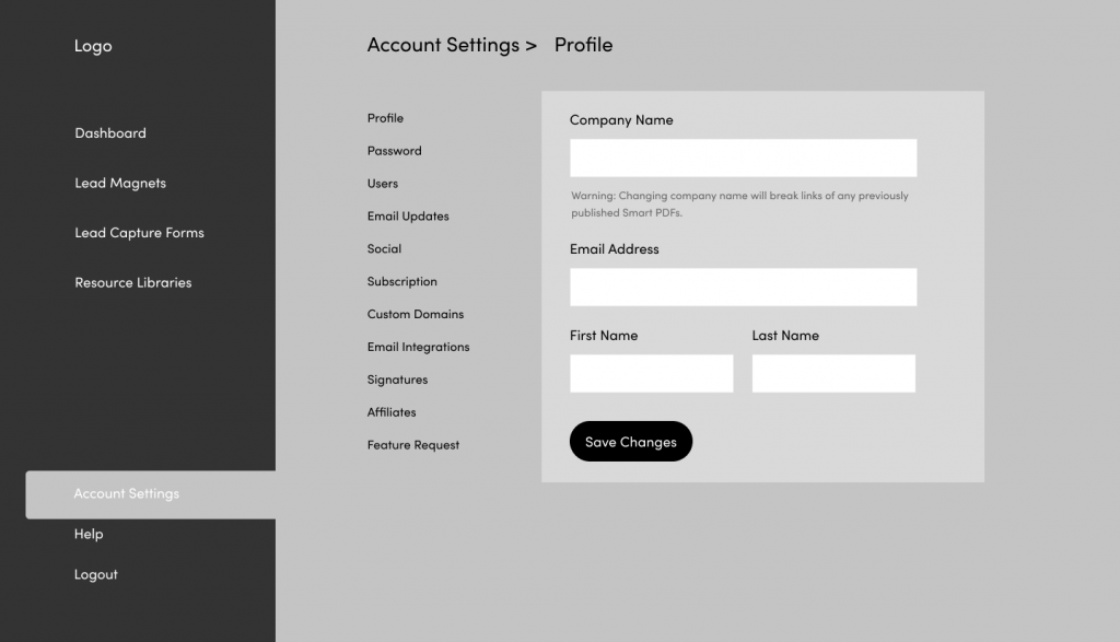
This was an obvious improvement as there was a clear visual hierarchy between the primary menu and the secondary menu. The entire page was also more compact which helps users to complete tasks more efficiently on pages like this one.
What About Mobile?
The seconda vertical nav essentially created a three column layout which I knew wouldn’t work on smaller screens. This is where my experience with HTML / CSS comes in handy as I knew I could reorganise the page on smaller screens without creating a headache for my dev team.
For medium sized displays like tablets in portrait mode I could add a sticky navbar at the top and collapse the primary navigation into a hamburger menu. This would create a two-column layout:
Smaller displays like phones are a bit trickier. I had to reduce the layout to one column but I didn’t want to hide the sub-nav with another collapsable menu since users would lose the context of their location in the app every time they opened the menu.
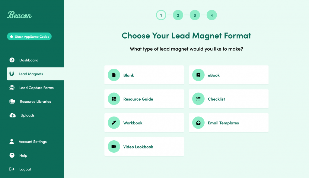
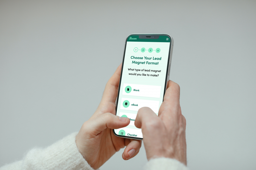
One design pattern that has been well established on mobile is the use of horizontal tabs with a sideways scroll. This type of interface is used in lots of high profile apps so users have become accustomed to it:
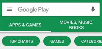
Applying this pattern to my wireframe worked pretty well:
At this stage I was confident that my general layout and navigational hierarchy would work for most page types at all screen sizes.
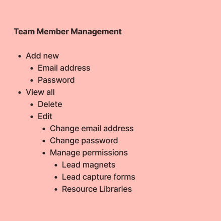
Additional Functionality
I mentioned earlier that the settings area would be complicated because of some additional functionality. Some tasks require more user interaction than a simple form. Take team member management for example, it requires 3 states:
- Overview (see all existing team members)
- Creation (add new team member)
- Management (set individual team member’s permissions)
Team member management isn’t a feature that’s unique to Beacon so I was able to look around at how a few other apps to see how they approached this.
After some industry research I made a simple list of all the actions that our users would need to perform on the team member management screen:
The best way to tackle this type of complexity is to get some content into a wireframe as soon as possible so you can see where the obvious problems and barriers are.
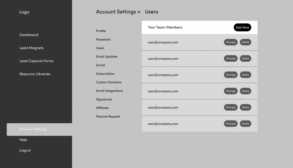
The ‘view all’ screen seemed fairly straightforwad until I needed to add the ‘create user’ functionality. I tried an accordion style that would reveal the form when someone clicked the ‘add new’ button:
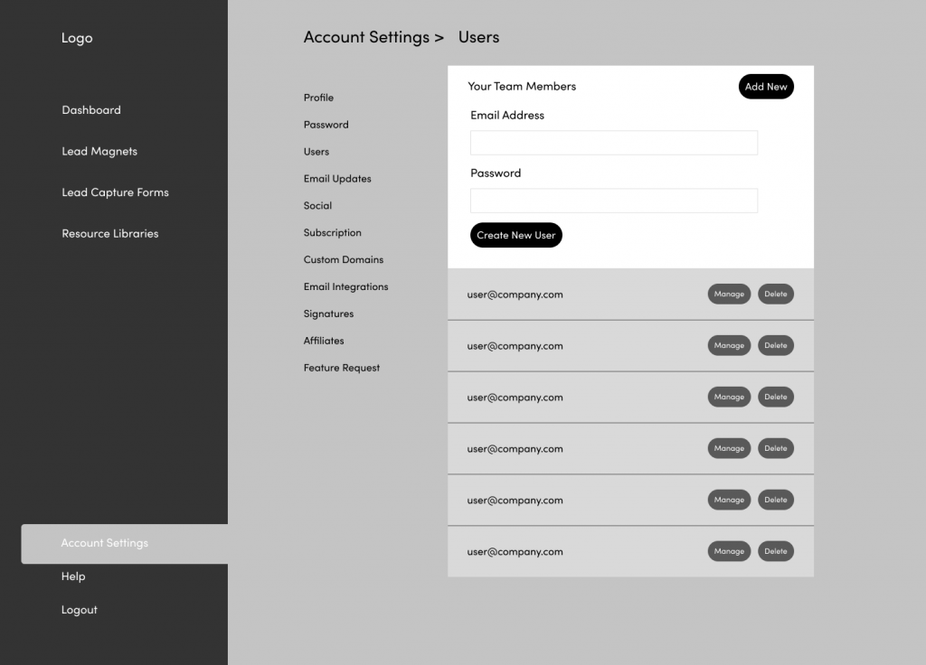
But there is just far too much going on here. My general rule of thumb is to have one action per screen and there is at least 3 going on here.
One option to offer users more focus as they complete a task is to use a modal. It’s faster than loading a new page and users will still see the parent page in the background so it gives some important context:
This definitely simplifies the task by taking it out of the main flow of the page and since this particular form is only 2 fields it is well suited to a modal. Side note – long forms and content don’t work so well in modals because people don’t realise they need to scroll within the modal area.
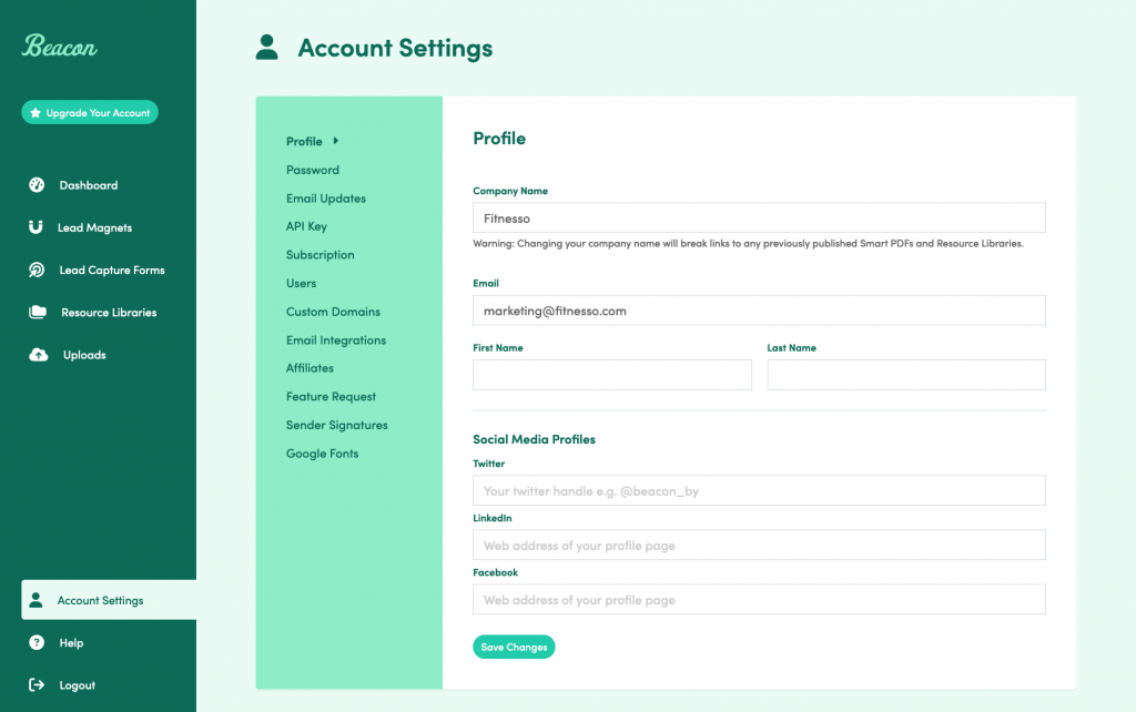
Mockups
One of the big goals of this redesign was to update the visual design of the product so once I had determined the functionality and layout I could then spend a bit more time working on colors, iconography and typography.
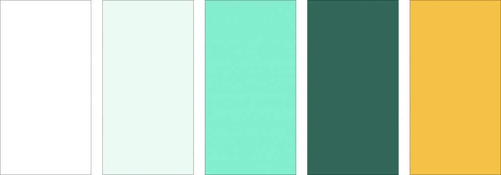
Colour Palette
We had been using green (#22ccaa) as our primary brand colour for a few years at this stage but I wanted to extend that to a monochrome palette of about 5 colours so I could offer contrast throughout the interface without overwhelming the user.
Here’s the palette I settled on:
And here’s how that looked when applied to the wireframes:
Most web apps are fairly plain (for good reason) so a green product is quite a bold choice. I really wanted people to feel our brand when they were using the product and colour does so much to achieve that.
Iconography
Beacon’s brand was always intended to be soft and approachable. Customers are a mix of consumers and businesses so we had to try to appeal to both. Our existing icon set was too cutesy so it risked alienating our business users.
I settled on Font Awesome for our brand icons for a few reasons:
- Choice. With thousands of icons in their library you will always find what you need.
- Ease of integration. With the icon web font and SVG options I can quickly use an icon in a design without hunting for hours through image folders.
- Brands. Font Awesome have lots of brand icons included natively which is mega useful when designing our integration screens.
- Aesthetic. The classic FA look has a rounded, soft appearnace. I thought this was the perfect choice for our mix of B2B and B2C customers.
Front End Development
Once the design was finialised I converted the mockups into HTML / CSS. I do this myself for 3 reasons:
- Interaction design. Products are interactive so you need to click through them to truly feel what the end user will experience. This can be replicated up to a point with Figma prototypes but the design is going to need to be built eventually so I think the designer is best placed to make decisions on the fly about implementation.
- Mobile refinement. I don’t like spending a huge amount of time making dozens of mockups for various screen sizes. Unless you’re presenting to a client it’s time that could be better spent elsewhere. I think it’s faster and more efficient to just build the thing so you can experience the actual design on different devices.
- Dev Team Hand Off. Handing developers a fully built version of your design means that there is less chance of misinterpretation.
Launch
After some comprehensive in-house testing we released the new version of the dashboard to our user base in phases. We braced ourselves for some potential backlash from users who were traditionally change resistant but much to our delight the feedback received was overwhelmingly positive.
I did monitor support conversations for any signs that people were struggling with the redesign and I did find a few opportunities to improve upon the original release based on user feedback.
Results
In the 3 months after launch we saw the following results:
- 20% reduction in churn
- 12% increase in expansion revenue
For a project that took six weeks from start to finish we were delighted with these results.